For our last visiting designer weekend, Maureen Mooren from the Netherlands had us messing around with each others posters.
We started out by all bringing an image and a single word to our first meeting. We then handed them off to a fellow student to create a poster with. There had to be some sort of connection between the word and image, not just a beautiful composition. We had a limited amount of time to work on each iteration of each poster before we then handed off our creation to another student who would then improve it.
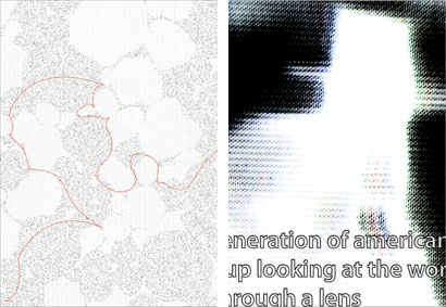
To start, I received an abstract black and white image with the word “beginning”. After some fun with the photocopier I returned to the original image and thought of it as a sort of landscape. This combined with “beginning” I eluded to the idea of a journey with a path (dotted line) branching away from the word and meandering about. During the critique we agreed that the concept would be stronger if there were multiple paths stemming from the same place or if the dotted lines weren’t there at all, indicating that the journey could go in any direction and hadn’t begun yet. That was up to the next student to work on.
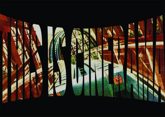
For my second poster, I received an image of an old movie theater and the word “cinerama”. The first version of the poster played with the formal relationship between the image and the word but did not have a conceptual link. Though a gorgeous image, I decided to abandon the movie theater and just work with the word “cinerama”. The technology was introduced in the ’50s and allowed for a movie to be projected in a way that engulfed the viewer, it was a precursor to today’s IMAX movies (the guy who invented the cinerama technology, Fred Waller, also invented water skis.) I was interested in conveying the experience of being in the audience at one of these screenings and working with an image from the first movie made for cinerama, “This is Cinerama” produced in 1952.

My last poster featured an image taken from a television screen along with the word “lens”. The first version of the poster pushed the idea of an old rgb television and the first student brought in a quote with the word “lens” in it. I felt the type could have been better integrated into the image and so I made it look like a subtitle. Much of the quote was cut off but enough of the information came through to get to the heart of the message, ” A whole generation of americans, maybe two, has grown up looking at the world through a lens.”
All told it was a great weekend with Maureen who critiqued us in a very direct and very dutch manner. It was refreshing to hear exactly what was working and what wasn’t to get us to simplify and distill meaning to its core. The goal was to make a good poster and not fuss with the design too much. Many of us were over thinking and our design was improved by freeing up our approach.